A redesign for Google’s desktop to do list
Brief
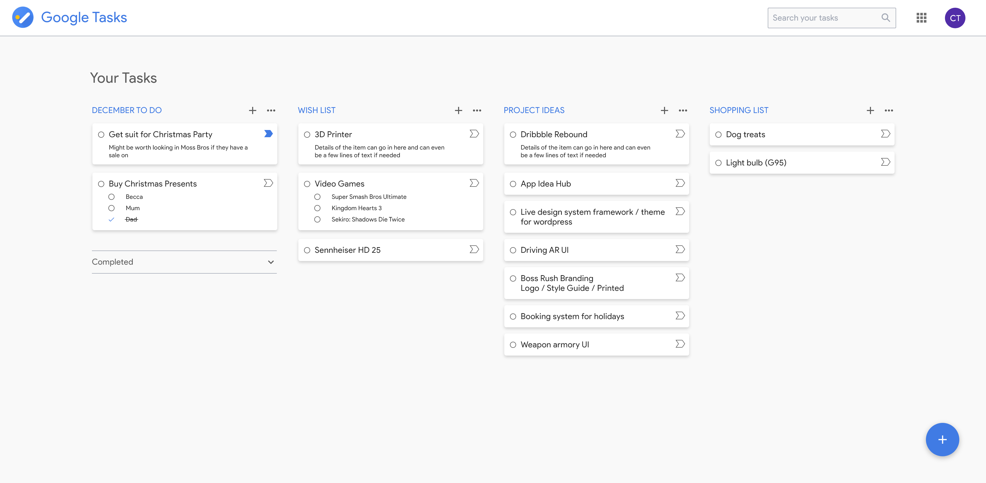
With one of Googles latest updates they completely abandoned the standalone web version of google tasks, opting for a sidebar / access panel for the app. Whilst this is good in some scenarios such as assigning tasks in parallel alongside emails, I find it intrudes heavily into the screen and can lead to a cognitive overload having all of it on screen at once. This gave me the idea of creating an updated version of the standalone application, following Googles design guidelines so this is what I proceeded to design, bringing the desktop app up to date with their sleek mobile application.
Role
– UI / UX Design
Tools
Adobe XD

Updated layouts following Googles design standards
Using Googles colour, shape language and typography really brought this design to life and I think it would benefit a lot of their users greatly if they relaunched the standalone version as it helps to decrease information overload as well as displaying tasks in a much clearer full screen layout.
